I built my first website, an online version of my university’s literary journal, in 1999. Actually, I convinced my much smarter roommate to build it for me, then I duplicated his template, copied and pasted each story or poem from QuarkXPress into NotePad, and added a few basic HTML tags. And boom — we were live on the web.
I was instantly hooked. Even though I had no programming skills and very little training in graphic design, I decided to start an online literary magazine after I graduated. I was working on Capitol Hill, and The White Shoe Irregular was an attempt to keep my creative juices flowing. A couple of friends helped me get the site up and running (thanks, Josh and Weston!), and within a few months, we were publishing a new piece of fiction, poetry, or satire almost every day.
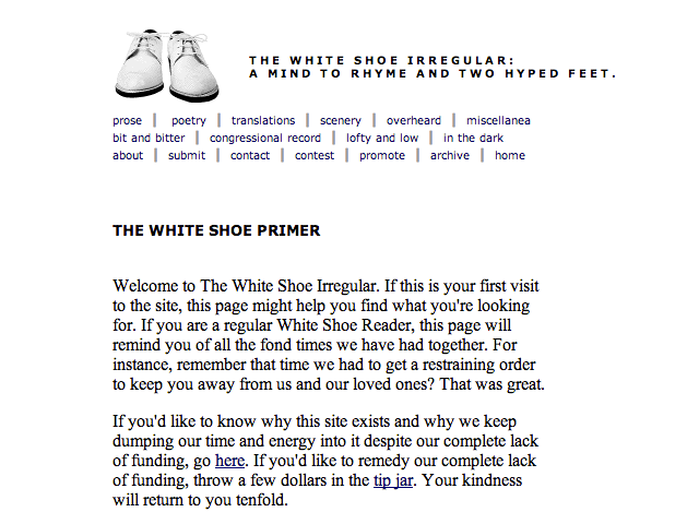
When Movable Type came out, my life got much easier. I no longer had to spend two hours every night marking up the next day’s piece and renaming files via FTP. And thanks to our shiny new content management system, the site’s design became much more sophisticated. (Translation: I added a sidebar.)
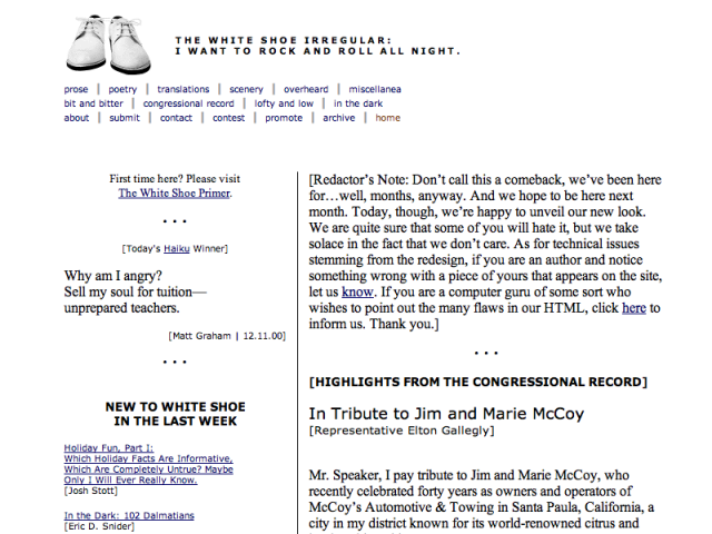
The site got featured on a few “cool page of the day” websites and even won “Best Content/E-zine Website” at the 2001 South by Southwest Web Awards. (I had no idea what SXSW was, so I didn’t bother to show up for the awards ceremony. My life might be very different today if I had made the trip to Austin.)
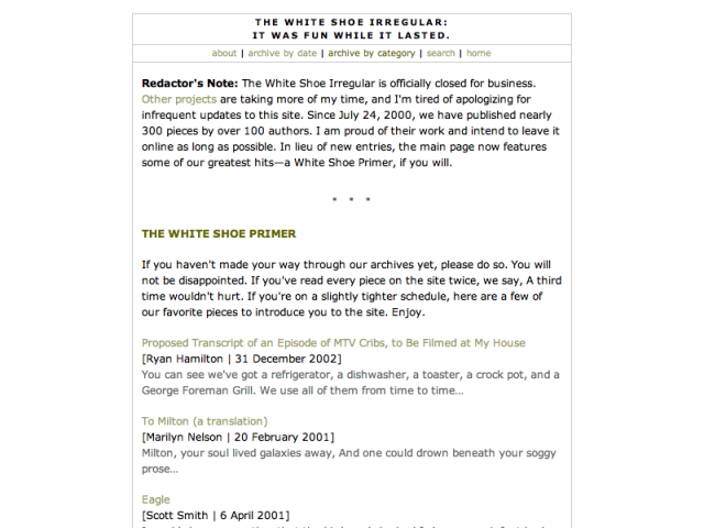
Around mid-2003, my enthusiasm for the site began to wane (one can only imitate McSweeney’s for so long), and rather than let the site live up to its name, I decided to shut it down. I am happy to note that the site has never gone offline — the entire archive is still available.
Almost immediately, I began working on a new site called Gnoyle. (Yeah, I know, terrible name. It’s a long story.) But deciding exactly what the site should be and do and look like took a little longer than anticipated. I think the “Coming Soon” page was the only thing on the site for the better part of a year.
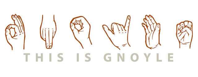
Eventually, I decided not to decide, and Gnoyle became the place I published anything and everything that was on my mind — short fiction, book and movie reviews, interesting quotes, and bizarre overheard conversations. I even made a bold departure from my black-and-white color scheme.
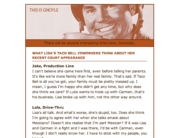
Gnoyle lived on to see a few more iterations…
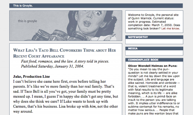
But grad school was right around the corner, and I soon found myself with another stagnant site on my hands. This time, I took down the site and gave up the domain name. In the intervening nine years, no one has claimed gnoyle.com — a sure sign that I could have chosen a better name for the site.
At Iowa State, I created more electronic portfolios than I care to remember. The process was always arduous, but each site that I created taught me a little more about web design and little more about what I wanted my online presence to look like.
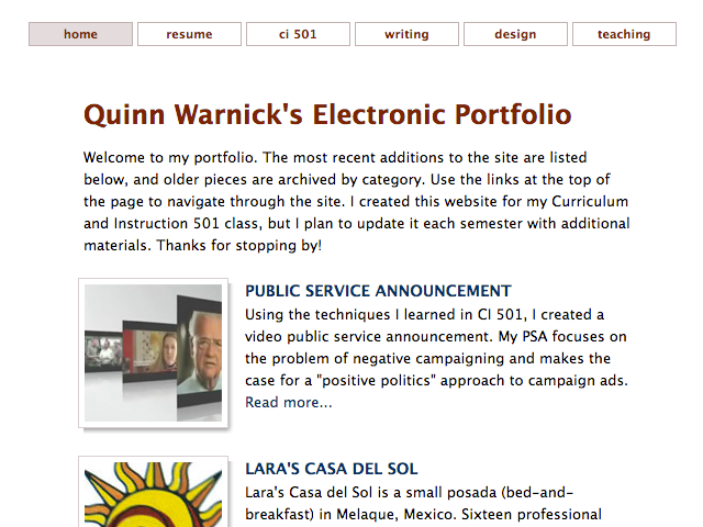
At some point (2006? 2007?), I decided I needed to own a professional domain name, so I went with the obvious choice and registered quinnwarnick.com. (Thanks, ancestors, for having a unique last name! Thanks, Mom and Dad, for giving me a unique first name!) Of course, registering a domain name and creating a site are two very different things, so I was back to a “Coming Soon” page.
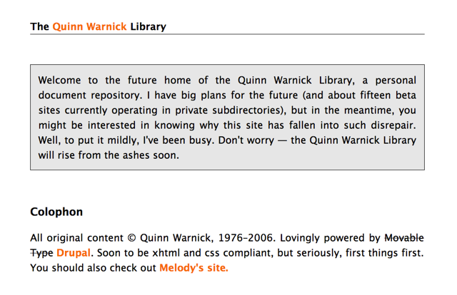
When that got too embarrassing, I added a splash of color and a few links to spruce things up.
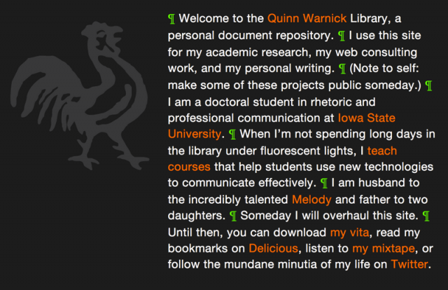
In 2009, I scrapped the rooster and went completely professional (i.e., boring) for my academic job search. I added teaching and research statements, teaching evaluations, an HTML version of my c.v., and a fancy contact form. For the first time in five years, I was almost practicing what I preached to my web design students.
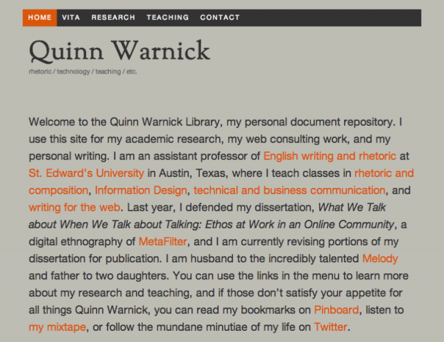
And, sadly, that’s how the site has looked for the past three years. Other than minor updates to reflect job changes or the new courses I was teaching each semester, quinnwarnick.com has been ridiculously stagnant.
So. It’s time for something new. I’m not quite sure what that something will be, but I hope it involves more regular updates, some reflection on remnants from my digital past (like these screenshots of old sites), and better integration of the many scattered pieces of my digital present. I’m asking the graduate students in my Digital Self class to develop (or redevelop) an online presence this semester, so it only seems fair that I should play along, too.
To get started, I’ve stripped down the site to a default theme and moved a few things around. The final version of the site (if such a thing can be said to exist) will be taking shape over the next few months, and I’ve decided to keep the site live as I work on it, so things might look a messy for a bit. With any luck, the mess won’t last for another four or five years.
